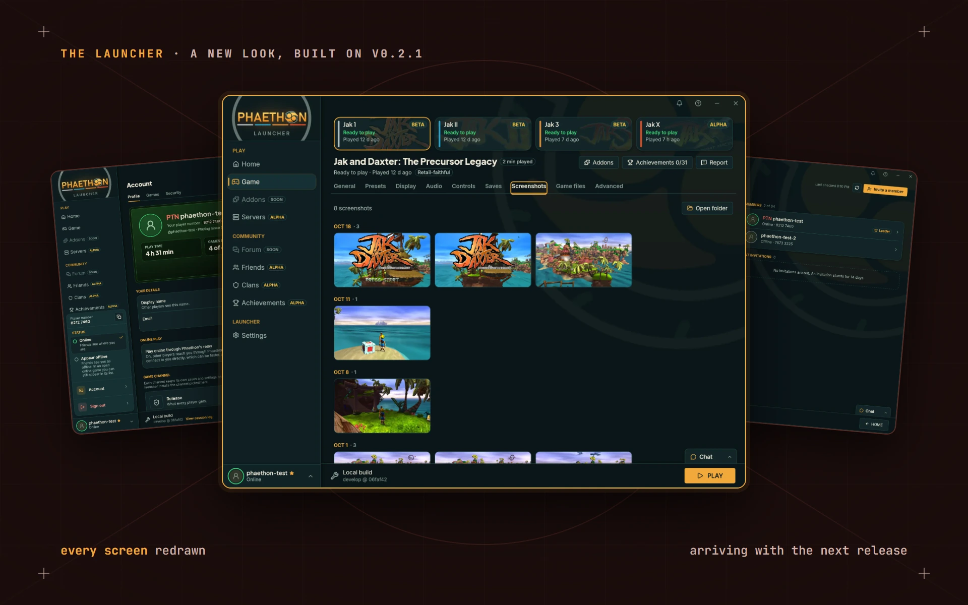
Launcher 0.2.1 went out at the end of October, and a lot of my time since then has gone into the launcher. I started from that release and went through it page by page, and by the end of last week nearly every screen had been redrawn.
The launcher isn't the whole story, though. Just as much effort, if not more, is still going into the rest of the project: the games themselves and online play. Those will get posts of their own. This one is about the launcher, because it's the part that changed the most to look at.
None of it is in your hands yet. The building is mostly done, and I'm now in the testing and refinement part of this update: using it every day, finding the rough spots and smoothing them out. It all arrives together with the next launcher release, so think of this as a look at what's coming.
One look, everywhere
Phaethon's launcher started life as a fork of a launcher I wrote some time ago, and it carried that older design along with it. New pages were added one at a time on top, and it showed: Settings looked one way, the Game page another, and every dialog had its own idea of where the buttons go. It was time to bring the whole thing up to date.
Now everything shares one design. Every setting sits on its own row, with its name and a line of help on the left and its control on the right. Things you turn on and off are switches. Lists sit in rounded groups, pages share one header, and PLAY and the other main buttons share one accent color. Buttons that delete something are set apart in a softer red, so they're easy to spot and hard to press by accident.
It moves a little more, too. Tabs slide, new rows ease in, and the sidebar's marker glides to the page you picked. Home now leads with the game you have selected, its logo nice and large, with announcements and news underneath.
I also went through the words. Settings and dialogs now say what a choice does in plain language, and leave out how it works.
A proper welcome
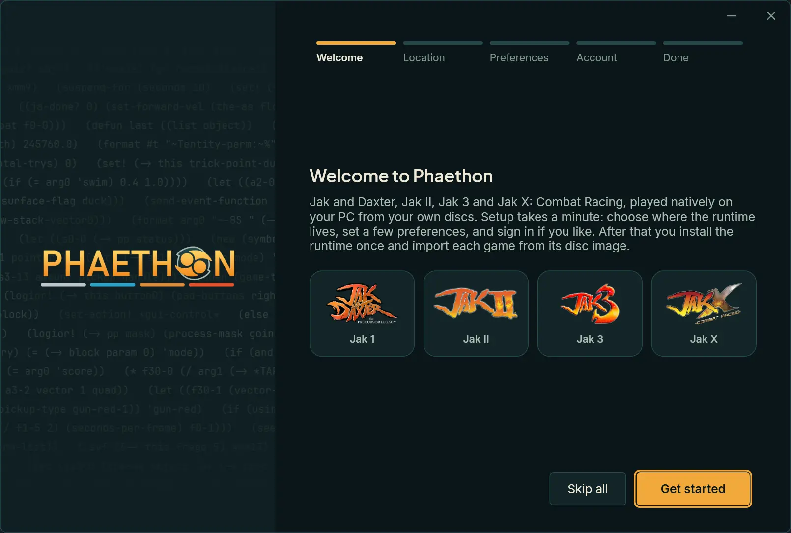
The first-run setup used to be a small box over the launcher. It now has the window to itself and takes you through five short steps, one at a time: a welcome, where the runtime lives, a few preferences, signing in if you like, and done. When you finish, the logo travels over to the sidebar and the launcher comes in around it, piece by piece. It's a small thing, and it's my favorite part.
The bell
The launcher used to tell you things with little pop-ups that were gone a few seconds later, whether you saw them or not. Most of those now go to a bell at the top right of the window instead.
The bell lights up when there's something new and keeps a list you can come back to: an update that's ready, an import or a rebuild that finished, a backup of your saves, a crash and what became of its report, a reply to a report you sent. Picking one takes you to the right page. It plays a short chime, never over a game, and you can turn the chime off in Settings.
The Game page
You pick a game from tiles across the top of the Game page now, and the page shows PLAY right there. Your play time sits beside the title.
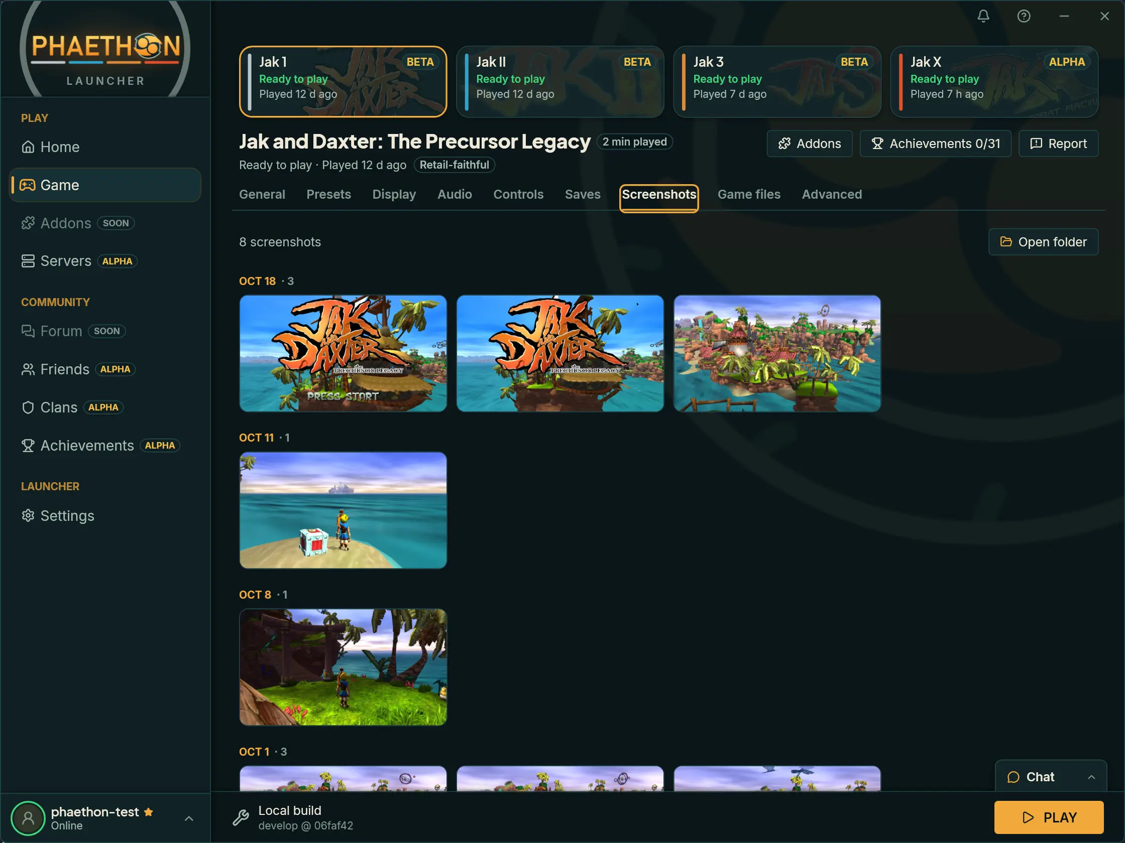
There's a new Screenshots tab, which gathers each game's pictures by day.
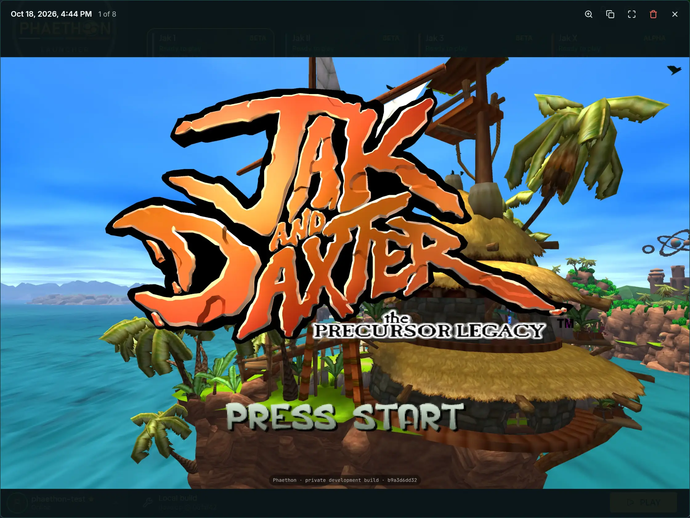
Pick one and it opens in the new photo view, over the whole launcher. The top bar shows when the picture was taken and where it sits in the set, and from there you can zoom in, copy it to the clipboard, go full screen or delete it. Deleting sends a picture to the Recycle Bin, so nothing is gone for good by mistake.
Presets got friendlier. The built-in ones and your own stand in two groups, and yours open a side panel that shows what they set.
If I had to pick, though, presets are still the weakest part of the launcher. The launcher and the game both read your settings from one shared list, and a preset is the launcher writing its choices there for the game to pick up. Right now the game doesn't always pick them up the same way twice. That's not the games changing. It's everything that runs them: the renderer, the kernel and the drivers are all still shifting underneath, so when and how a setting takes effect keeps moving. It'll steady as they do, and it's high on my list.
And if you like to start your games from Steam, Add to Steam on a game's General tab puts it in your library. The entry it makes is still plain: it doesn't have its art or a proper icon yet. You can set those yourself in Steam, or wait for me to get to it.
Friends, and a card of your own
Your Account page now shows the same profile card as your account page on this site, and Customize lets you pick its colors and background. You can already do that on the site today, and the launcher will show the very same card.
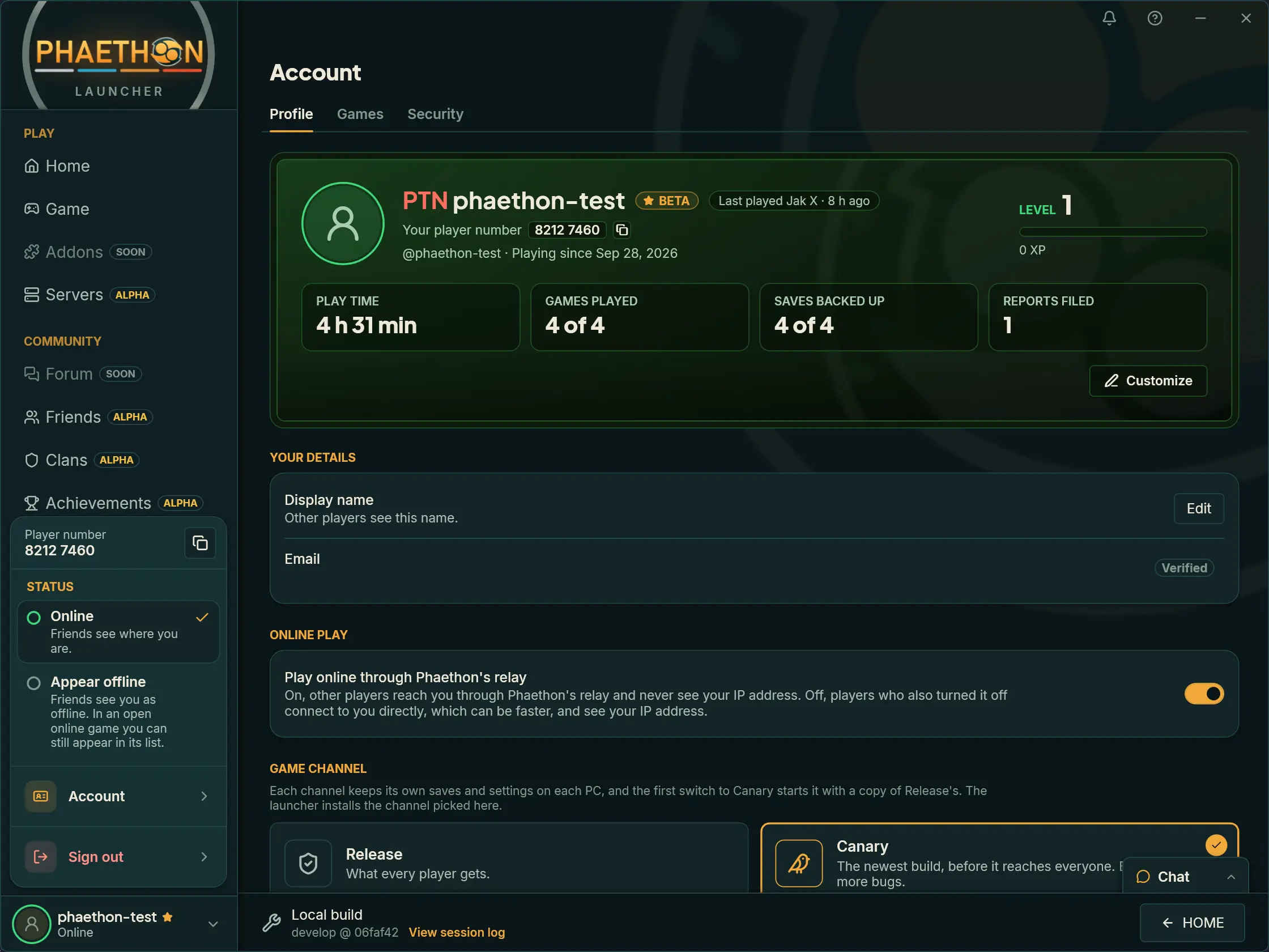
The beta testers get the most new pages. Friends and Clans join Achievements and Servers, and all four wear an Alpha badge, which means they're early and still changing. For now only players in the beta can open them.
On Friends you can add a player by number or by name, see who's online, and open anyone in a side panel with their card and what you can do from there. If you'd rather be left alone for an evening, Appear offline in the account menu shows you as offline to your friends. Chat lets testers write to their friends from any page, too.
If you're not in the beta, these pages will open up to you as they settle.
One social world, shared with Jak X
Here's the part I'm proudest of. None of these pages is a separate little social network bolted onto the side of the launcher. They come out of Jak X's own online play and build on it. Friends is the clearest case: it is Jak X's friends list, brought into the launcher and given more to do.
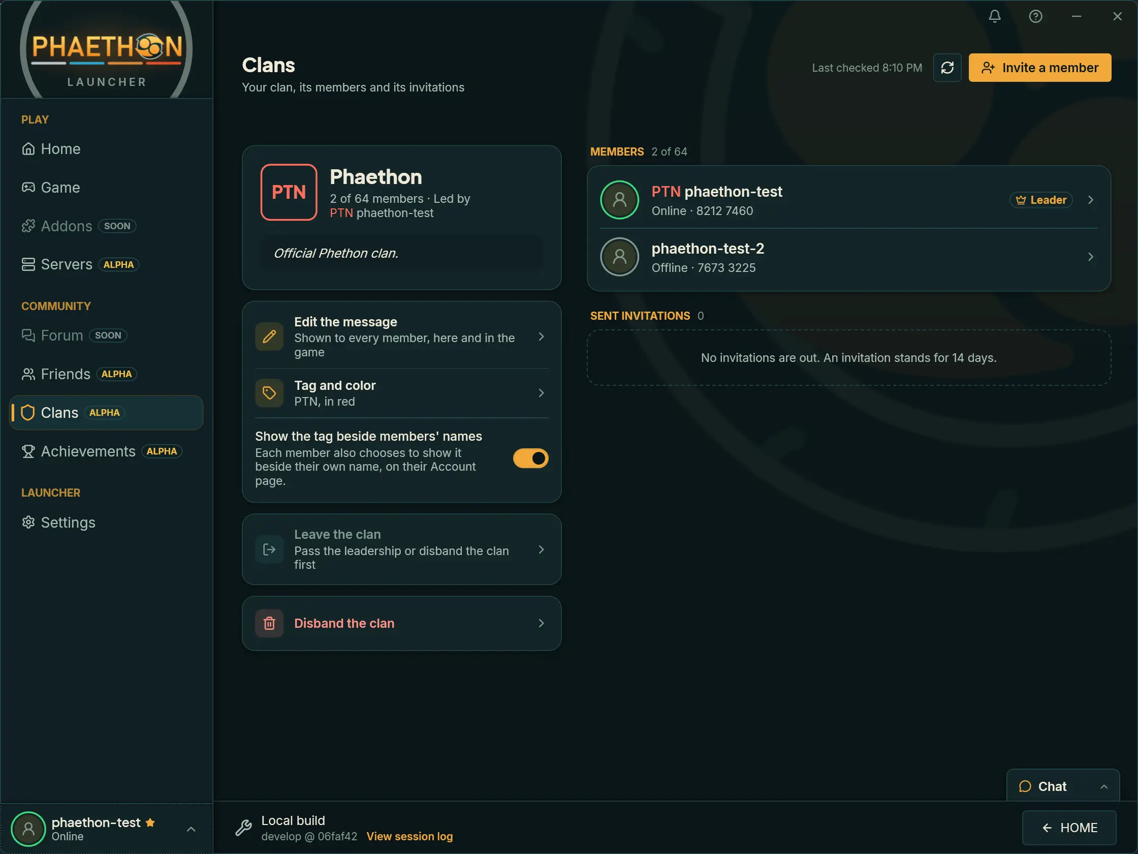
So a clan you make in the launcher is your clan in Jak X. Its message shows to every member in both places, and its tag can sit beside its members' names. A friend you add here is on your friends list in the game, because it's the same list. When a friend invites you to a race, the bell rings in the launcher and Join takes you in. And your friends can see whether you're in the launcher, in a lobby or in a race.
That's only possible because Phaethon's online play is built here, from the ground up. Sony's service is long gone, and I didn't rebuild it. I wrote a new one, so the launcher and the game can share one account, one friends list and one set of clans, and each side knows what the other is doing. A launcher sitting beside somebody else's servers couldn't do that.
It's all still in alpha, and not every part of the Jak X side is in testers' hands yet. It reaches the beta's Canary builds a bit at a time. But the two halves are being built as one thing, and that's what I want the social side of Phaethon to feel like.
When something goes wrong
This is the other big addition, and with luck you'll rarely need it.
The games are still in alpha and beta, so they will crash sometimes. When one does, the launcher now notices, tells you, and sends me a crash report by itself: what went wrong and your PC's specs, with no account attached. You can turn that off in Settings. If a game stops responding, the launcher asks whether you'd like to send its log. And if a game crashes twice in a row as it starts, PLAY offers to start it once without your preset, which is usually the quickest way to find out what broke it.
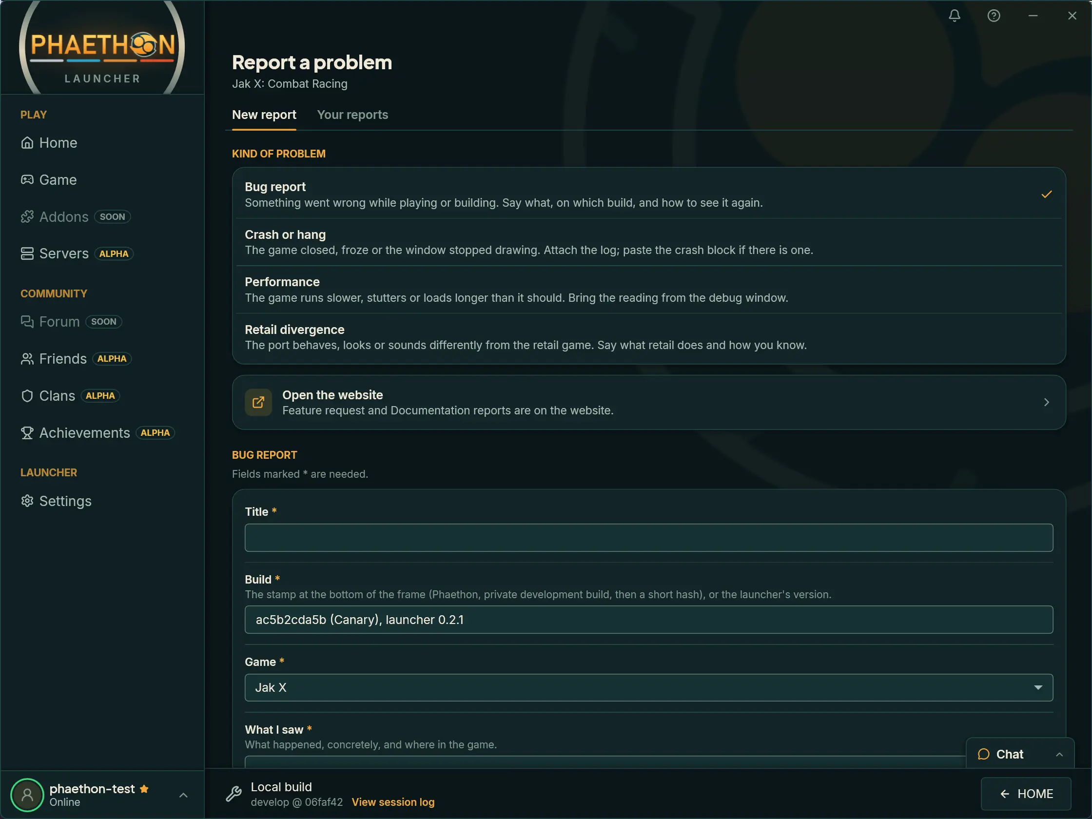
When you want to tell me about something yourself, the Report page has a form for each kind of problem: a bug, a crash or a hang, slow performance, or something that differs from the original game. It's the same report form that's already on this site, now much easier to reach: it's a page of its own in the launcher, and every game's page has a Report button that starts one from your last run. It fills in the build you're on, shows you everything it will send before it goes, and takes your names out of the log first. Your reports tab lists what you've sent, and my replies show up right there and in the bell.
On my side, every crash and every report now lands in one dashboard, where I can sort them, see which ones keep happening and answer you. That's what makes the rest worth doing: a crash on your PC turns into something I can find and fix.
What's sent, and how long it's kept, is all on the Privacy page.
Sturdier underneath
A new look is the part you notice. A good share of this update went into things you only notice when they go wrong, so here's what changed under the surface.
Your saves are safer. PLAY, updates and restarts now wait while saves are being imported or restored, so a game can't start without them. The Saves tab keeps the copies made before an import or a restore, so you can always go back. One switch turns cloud saves off for every game, and each automatic backup shows up in the bell.
It works without a mouse. A game controller moves through the launcher, so you can pick a game and press PLAY from the couch. Tab and the arrow keys reach every page, panel and dialog, the focus no longer gets lost when a dialog opens or a row goes away, and a screen reader is told what changed.
Reports carry less of you. Before a crash report or a log is sent, the launcher takes out your Windows account name and your display name, and it no longer passes along stray text from a damaged file. And it names your PC by a random label, never its Windows name, when it backs up saves or counts play time.
Your account is in your hands. From the Account page you can download a copy of your data or delete your account, without leaving the launcher.
It fails better. The launcher refuses a release it can't identify instead of installing it, sets a damaged mods list aside instead of tripping over it, and shows the right version straight after a repair. Release and Canary also keep further apart: each keeps its own choice of preset, and the uninstaller offers Canary's files separately.
A few smaller things round it out. Closing the window leaves the launcher in the tray, which you can change in Settings. Every dialog has a way out, and several that used to ask "are you sure?" for no good reason no longer do. If you'd like every last detail, it's all in the changelog.
None of this is decoration
One more thing before I wrap up. A post full of screenshots can make all this look like a coat of paint, and it isn't.
Everything you can see here has hours of work behind it that you can't. A friends list needs somewhere to keep your friends and a way to tell them you're online. A clan needs its members, its invitations and its tag kept somewhere both the launcher and the game can reach. A report needs somewhere to go and a way for my answer to come back. All of that lives in Phaethon's online service, the API, and seriously, every feature here made it bigger.
So when a page in the launcher looks simple, that's the goal. The hard part is underneath.
It's also a lot more than a runtime and a launcher. Phaethon is seven separate pieces of work by now: the runtime that plays the games, the launcher, the online service behind your account, the relay that carries races, this website, the tools that test every change before it lands, and the brand that ties them together. Most of them you'll never open, and most of them had to move for this update.
A word on how it gets made, too. I use AI assistance on Phaethon, and I've never hidden that. It's a real help, and it lets one person cover a lot of ground. But no amount of it will build something you can't picture in the first place, or keep something running that you don't know how to support.
Somebody still has to decide what a friends list should do, what a crash report is allowed to carry, and how the launcher and the game ought to talk to each other. And once it's built, it has to live somewhere. Phaethon's website, its accounts and its online service all run on servers I set up and look after myself, so knowing how to host it, secure it and keep it up is as much a part of this project as any screen in the launcher.
When
With the next launcher release. I don't have a date for it yet, and I'd rather get it right than rush it. I'll post here the day it's out.
Alex (maintainer, and a mechanical engineer by trade)